


The starting point taking action with the future in mind

4 years ago, I had my first meeting with the JINS Design Project team. When I was told that they were considering developing products specifically for women of my generation, I proposed that it might actually be a good idea to aim for an open approach to design, rather than narrowly defining the target users. This was also based on my response to the fantastic openness and enthusiasm of the JINS team.
One of the keywords that came up at the start was Contemporary Elegance. I noted that “Contemporary Elegance is about taking action with the future in mind”. A lot of projects that look at the future may, perhaps, tend to use cutting-edge materials and/or technology, but I felt like maximizing what JINS has built up, and to try to create eyewear that many people would enjoy using.
Now that I look back, I am struck by the realization that this starting point, this conversation with JINS, was crucial, a truly important first step. Just take materials, for example, the team and I had so much to talk about, that we discussed continuously. I will go into details later on, but it was crucial that what we used should be friendly to the environment.
And of course, we also had to ensure the quality of the glasses, that was an absolute must. There were many, many, proposals from the JINS team about materials and technology, resulting in eyewear designs with characteristics that have never been seen before. The name HILO describes the collection’s leading concept.

HILO, is a single thread. A situation that links together materials,
objects, and the hearts and minds of the users.


HILO is a word from Spain, where I was born and raised, and it means ‘thread’. A single thread, a continuous line, linking elements into a single flow. I also felt that HILO was the right name for this project, as it symbolizes an awareness of the future, and actions that are underpinned by this. The frames have a distinctive flowing form, which, I think, communicates this sense of a single continuous line.
It’s not just that, HILO is a Japanese name as well, isn’t it? I have a friend called Hiro, who I’ve known for many years, so it’s a sound that I really relate to. When I hear it, it makes me happy.
This design for HILO is closely related to the characteristics of the materials, and is inseparable from the technical challenges that we faced. Again, everything is connected by this single line. Do let me talk about the materials. For this project, I wanted to insist on sustainability. I wanted to be passionately engaged in carefully gauging appropriate materials, and making full use of their characteristics.
Out of the JINS team proposals, I decided to go with a bio-based sustainable material containing 45% vegetable oil (castor oil), not one that was 100% petrochemicals.
It is both durable and supple, so it satisfied the robustness and stiffness requirements for the injection moulding production process, and met all the conditions that we hoped for. This material has already been used to make eyewear, but never for the kind of forms that I was proposing, and, in fact, there were some concerns voiced by people connected with the project about the difficulty of the challenges in actually using this with injection moulding in producing these designs.
Whether the required details could be achieved properly - that question alone needed more than a year to resolve. But the JINS team worked incredibly hard, and I am overjoyed that we have managed to be sustainable as well as satisfying JINS standards for sturdiness. Weight is also crucial in creating glasses that become a part of your face, and this material is feather-light. So, this is how we created glasses to be worn on a daily basis, with a suppleness that has never been achieved until now.
My thoughts about sustainability and society apply to the special packaging as well. Recycled materials, and soy ink to print the logo.
Two types LAYERS and FLUID

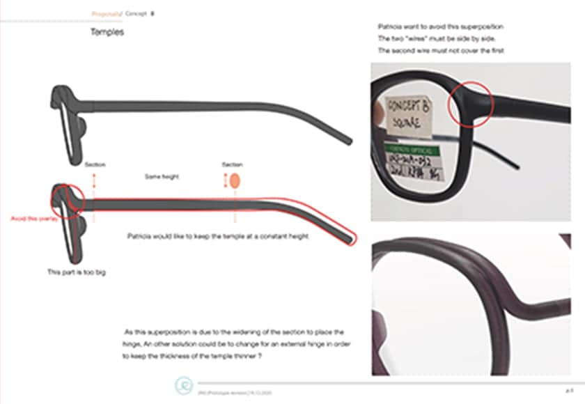
When I was designing, I drew a massive number of drawings, as I continued to think hard, all the time. I thought that gentleness was really important. This is a product which comes so close to your face, that I wanted a form that would feel like that of course, and also to create frames that suited your face, and to transform eyewear into a subtly elegant presence. I really concentrated as far as possible on gentleness, including the suppleness, the flexibility that you sense, from the moment you pick up the glasses, to the flexibility when you put them on. Based on this, I thought of two types of design, which each have two separate forms.
LAYERS has ‘assemble’ as the keyword, and is a design about layering, about linking together. Each of the parts that constitute a frame, such as the front, the bridge, the end pieces, and the temples are layered together, and so are the colors. The temples are really distinctive, and we spent many hours thinking about the shapes and the colors, and how to layer them.
FLUID is a design that consists of a single line running from the temples to the rims. I thought of how one unbroken continuous line could be drawn across the face in a subtle and sophisticated way, but this design with the line circling around from the front to the temples initially turned out to be very demanding, because of the requirements of how to specify shapes that would be strong enough to support the lenses, so we needed to spend a tremendous amount of time in adjusting the minute details of the actual form and thickness of the frame. Getting the details of the hinges which connect the front and the temples exactly right, with the precision that was called for in order to completely hide the hinges when worn, for example, is a long story of incredible obstacles that we had to overcome.
LAYERS and FLUID each offer two design options - ROUND and SQUARE. ROUND is actually not a true circle, and the form has been adjusted to suit the human face, likewise the front shape for SQUARE is smoothly rounded.
The design may appear to be simple, but these are forms that are the result of painstaking attention to every minute detail hammered out together with the JINS team, and a great deal of trial and error on the production side. I am really proud that we succeeded in realizing the initial design concept with bio-based material. Challenging the envelope of existing parameters meant that we were able to break through these limits in the best way possible.


Deep nuances
Unprecedented color choices
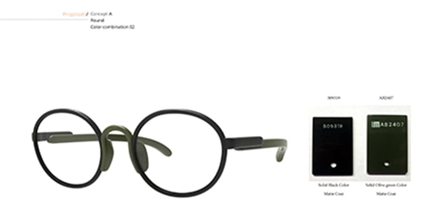
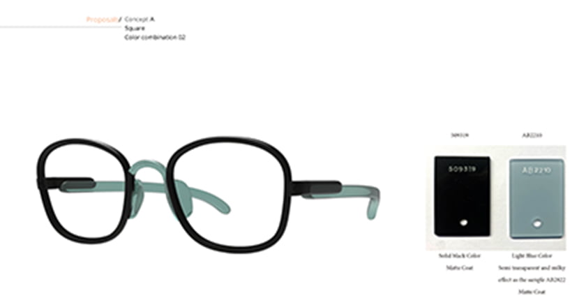

Speaking of challenges, we also did that with the coloring. Light blue and green are unusual choices for eyewear colors, but we made sure that they were shades that suited people well, that did not feel odd, and that they were calming and soothing for the face and the mind. Of course they also had to be colors that were not too strong, which might make the frames stand out, but washed out the wearer. This palette of options is a natural outcome of my basic thinking, and differs from colors that are based on the logic of product development. The brownish red, the blue, the black, they all have the deep nuances that are exactly what I was looking for. But above all, my particular favorite is this green. It is semi-transparent and subtle, it’s a type of shade that has not been available in JINS eyewear until now, and it is so incredibly right. Just look at it. This color, isn’t it exquisite?
The two color combinations for LAYERS, such as the black & light blue also came out exactly as how I had imagined the coloring, and I am really satisfied with the result. I think that this lineup of delicately and painstakingly designed colors embrace the individuals who wear them, enhance your attractiveness, and can be enjoyed by all, regardless of age or gender.


Patricia's thoughts
Re: innovation
The environment that surrounds us has changed drastically in recent years. We are now living in a world that demands a new way of thinking.
Designers are aware that we need to understand our position as intermediaries between engineers and users, and to make proposals accordingly. What we must cherish is conversation, and I firmly believe that continued discussions are what can allow us to create revolutionary circumstances
Fields such as workmanship and traditional handcrafts may be quite different from cutting-edge materials and technology, but they, too, can become sources of innovation by adopting completely new methods and processes of production. Above all, the designs should appeal to many diverse senses and sensibilities. That’s what is crucial. We should also never forget about innovation in our own thinking processes. To enjoy the process is my primary practice.
I always feel that what makes design and product development truly rewarding is how we are able to overcome challenges that could not be resolved with conventional thinking. Only by combining strengths and forces with colleagues and clients, by dedicating passion and enjoyment to aspects where compromise is unacceptable, can we achieve what is worthy of being described as true innovation.
As you can see, being innovative is an absolute must in all of my work, which is a constant process of research, but it does not need to shout out, or immediately stand out. That’s because groundbreaking aspects are integrated in the materials and technology that you select. What makes these glasses naturally approachable and appealing to as wide a range of people as possible, is the fluidity and flexibility of this collection. So yes, everything that has been achieved with HILO are all what I consider to be crucially important aspects of my design practice.
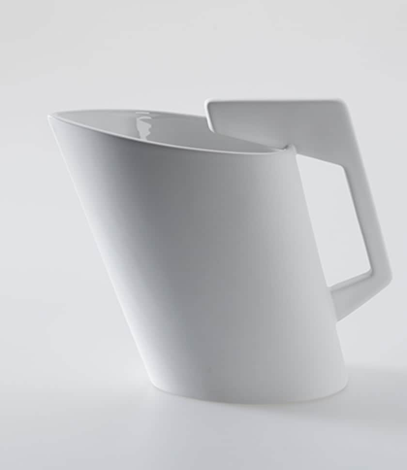
H2O Bilbao Jug
Designed for a charity project by Bilbao City Council, the Water Board, and the Slow Food Association Bilbao-Bizkaia, with the aid of Oxfam, that set out to transform how we regard the environmental impact of bottled water. About 10 restaurants in Bilbao charged a fee for tap water served in this jug, and the proceeds were donated to help transform girls’ education in Africa and elsewhere, where a major obstacle to school attendance continues to be the repressive tradition that women and girls must often travel far to fetch water for their communities.“ I was inspired by what can be described as an archetype of water jugs which has been traditionally used in the Basque region. Water as a means to transform society. An innovation in how we think.”
